
Maine the Way is a regional lifestyle publication dedicated to showcasing Maine life—its people, places, food, outdoors, and creative community—through quality storytelling and visual content across social media, print, and digital platforms. For ten years, they've done what most regional publications only talk about: taking their time, telling stories thoroughly, and building an audience that trusts them for substance over quick hits.
But after a decade of strong editorial work, MTW was ready to grow. They had plans for a subscription program called Friends of Maine the Way, branded merchandise, tourism partnerships, collaborations with Maine artists and creators, and an eventual return to print with guidebooks and coffee table books. The ambition was there. The brand system to support it wasn't.
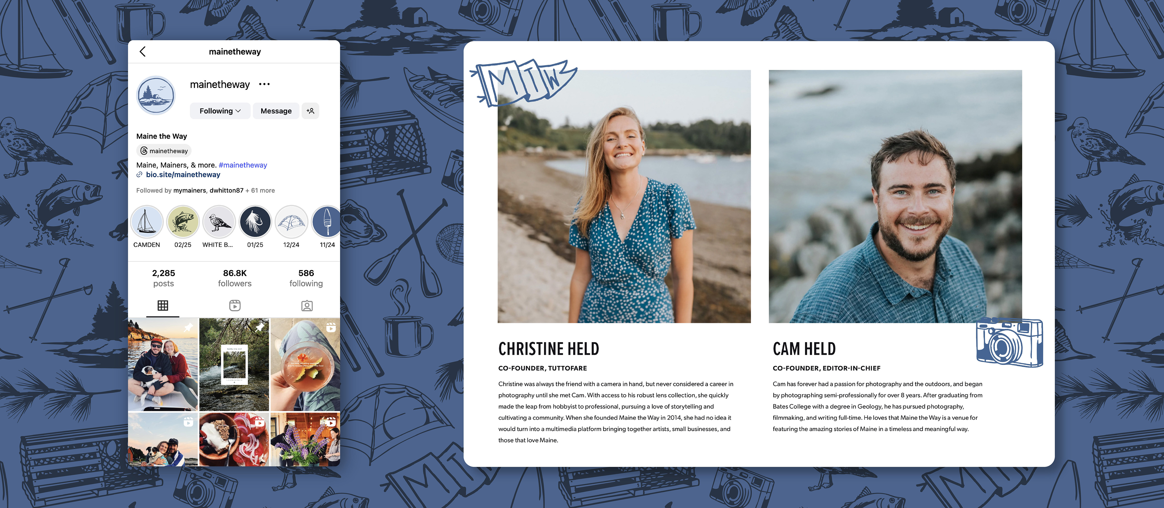
A non-versatile logo and an inconsistent visual language were quietly holding back a publication ready to scale. MTW needed a brand refresh—not a reinvention, but a foundation strong enough to build on.
MTW came to us as self-described intuition-driven creatives. They could feel what was right but didn't have the frameworks to articulate it or the visual system to execute it consistently. Our job was to translate strong editorial instincts into a strategic brand foundation sturdy enough to build on.
We started with a structured brand work session to surface what the team already knew intuitively—mapping brand attributes across culture, voice, audience, and impact. What emerged wasn't a new identity. It was a clearer picture of the one that already existed.
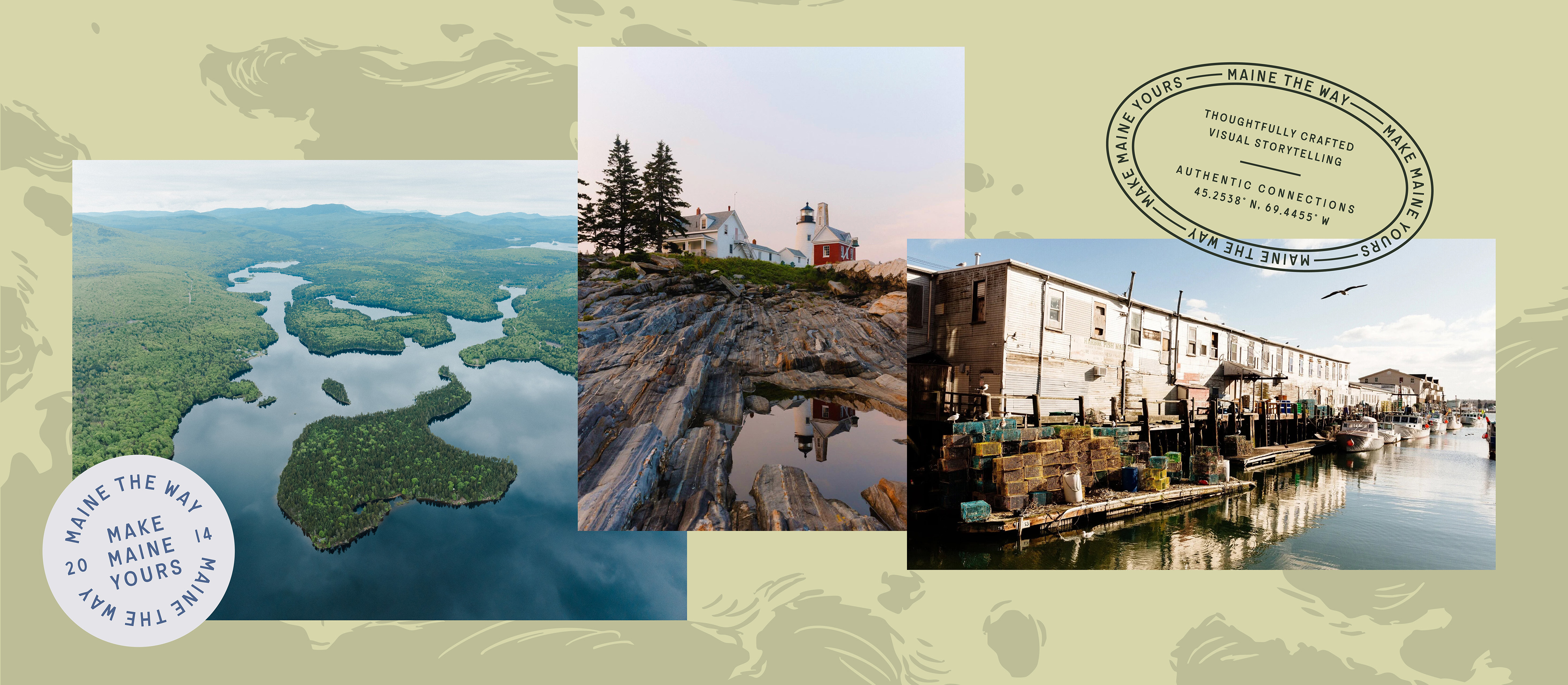
Early positioning work revealed three possible directions: storytelling, experiences, and sense of place. The team recognized that storytelling and experiences were branches of the brand—important, but not the trunk. Sense of place was the umbrella concept, expansive enough to hold everything MTW does now and everything they plan to do next. It touches their entire audience, whether someone's Maine connection is a single visit or a lifetime.
That clarity became the filter for every decision that followed—from tagline development to logo concepts to the visual direction of the entire identity system.
MTW's existing visual strengths were real: clean design, generous white space, strong photography, and a modern sensibility. We weren't starting from scratch. We were building a more versatile, cohesive system around what already worked.
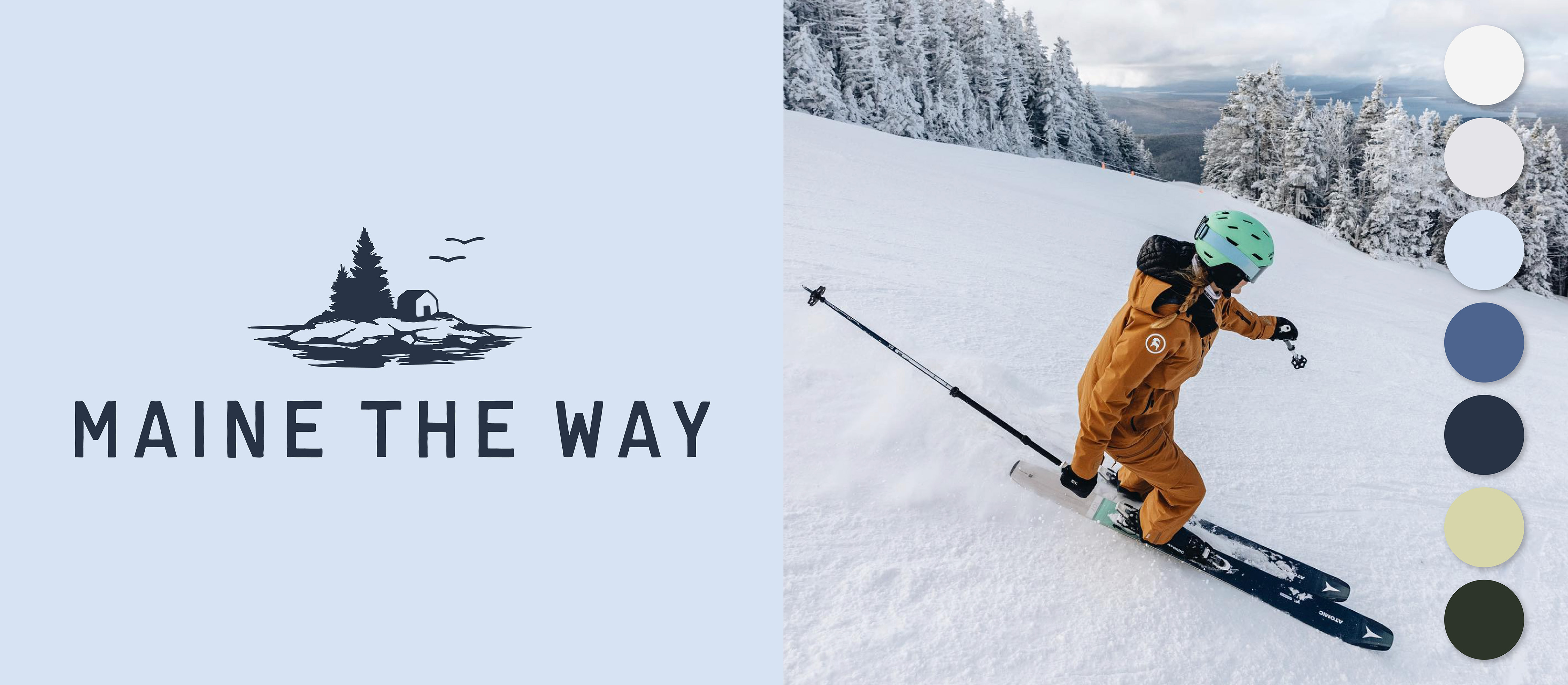
The team chose a visual direction that felt most honest to who they are—serene, spacious, naturally beautiful, authentic yet modern—while borrowing heritage-inspired illustration elements that added the timelessness and character they felt was missing. A palette of forest greens, oceanic blues, and coastal light replaced a visual identity that had been limited to black and white.
The logo exploration drew from three symbolic territories—wind, water, and land—each rooted in Maine's natural landscape and MTW's role as guide, storyteller, and companion. Every concept tied back to the brand's core positioning: spreading knowledge, providing direction, and deepening connection to place.
This refresh was the foundation for a publication ready to grow. A cohesive visual language that scales across a subscription program, merchandise, guidebooks, partnerships, email, and social. A positioning framework that keeps future initiatives on-brand without second-guessing. A logo system versatile enough to work on a magazine spine, a hat, and an Instagram grid.